

family and newbornphotography
STYLING GUIDE: OUTDOORS
cotswolds & cheltenham photographer claire westaway

you at your best…
This guide is here to help you decide what to wear for your photo session. As you know, my sessions are very natural and unique to you and the clothes you choose should reflect that. you and your family at your very best - but still you!
let’s go…

Styling Advice:
Colours…
* Try to avoid everyone wearing the same colour or same outfit. Instead, consider choosing one or two colours or a colour palette.
* You can never go wrong with soft, neutral and warm colours. They're timeless, everyone looks good and you won't look back and say "what was I thinking?"
* You'll see my colour palette board below - this gives you ideas for base colours which are more muted and subtle and then there are a few suggestions for slightly stronger colours to add a little warmth and pop of colour.
* Warm tones always work well because even if we get an overcast, grey day, your outfits will help give warmth to the image. I would always avoid too much blue in your clothing choices as blue can often have cool tones. Notice in the photo above - the little boy is wearing a blue t-shirt and it’s an overcast, grey day but the pink/peach of mum’s dress lifts the whole image and really makes the two of them pop.
* Avoid overly bold patterns that take away from the people in your photos. That's not to say patterns are a no. Soft florals can add a beautiful feminine touch. If mum wants to wear a floral dress, I just recommend that you don't compete with additional patterns from other people in the photos and keep their clothing more neutral.

Styling advice:
Seasons…
* Think about the season of your photo shoot and the colours which are going to be around in the location and the background of your shots.
* Golden, rusty hues look lovely in Autumn; neutral tones with pops of colour lift the colder tones of Winter; pastel colours work really well in Spring and pink, warm tones look lovely in Summer.
* Although my summer sessions often take place on a warm evening, it’s worth factoring in a few layers like cardigans for the kids in case it turns cooler towards the end.
* Winter sessions need to be practical and no one wants the kids feeling cold and miserable. So layers are key. We want to avoid big bulky outdoor wear like ski jackets so I would recommend things like a stylish coat with a cute bobble hat; a scarf for a pop of colour but without it covering your face too much; or no coat but lots of thermal layers underneath your clothes. We can always carry coats with us and pop them on when taking a break or moving around the location.
* Have a look at these images from photo sessions in the four different seasons: spring, summer, autumn, winter…


Styling advice:
General…
* Remove smart watches - they can look a bit clunky and you can imagine looking back at the photos in the future and only seeing the out-of-date technology rather than the beautiful moment.
* Please avoid logos or character t-shirts with children - they are distracting and will age your photos quickly.
* Pack a change of clothes for the kids - just in case they fall in that one muddy puddle before we even get started or spill their drink etc.
* I highly encourage Mum to choose her outfit first and then build everything else around this to compliment the clothing.
* My top tip is to lay clothing options out on the bed so you can see how the outfits look together. This will help you see if colours clash or there are too many patterns etc. You can take photos of these layouts and send them to me for advice if it's helpful!
Let me talk you through it…
These are photos from an outdoor family photo session in the daisy meadow - let me talk you through the outfit choices and why they work.
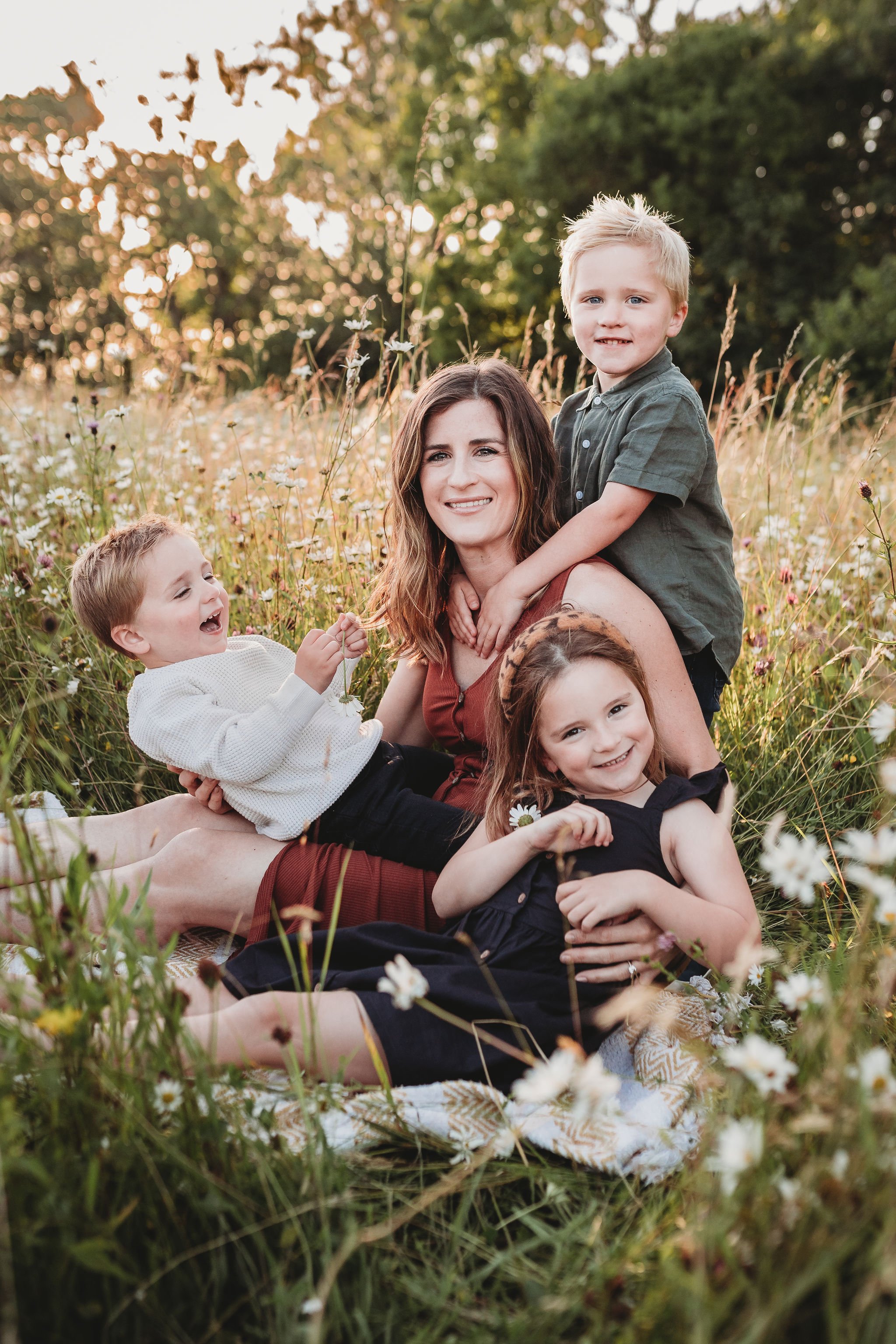
The colours…
All the colours are from the same rich, deep palette so they all work perfectly together.
Mum’s dress colour is integral here - it adds contrast to the greens and adds a warmth and pop of colour. All green or all dark blue would have looked too cool.
Notice how the green of the boy’s shirt contrasts well with the lighter coloured grass and daisies. So do think about where the photos are taking place and what time of year.
While the colours are of a similar palette and all the clothes are without pattern, there is still variety - the texture of the cream jumper vs the linen shirt. The dresses of the mum and daughter have similarities (the buttons) without looking too matching.

texture
The little boy’s jumper works perfectly because it is an easy neutral colour but it also has texture to it. This waffle effect adds depth to the photo and also makes means the neutral top doesn’t just disappear but has some natural contrast to it.
The combination with the colour of mum’s dress and the green in the background means the little boy really stands out.

in summary…
- start with mum’s dress
- lay everything out together so you can check that the colours and patterns work together
- look for warm tones - avoid cool tones like blues and greys
- think about the season and the location.
- consider different textures
- you don’t need to shy away from colour but it needs to all work together
- let me help! Send me photos of your possible outfits and I can advise you on how it’s all looking.